Magia Piura
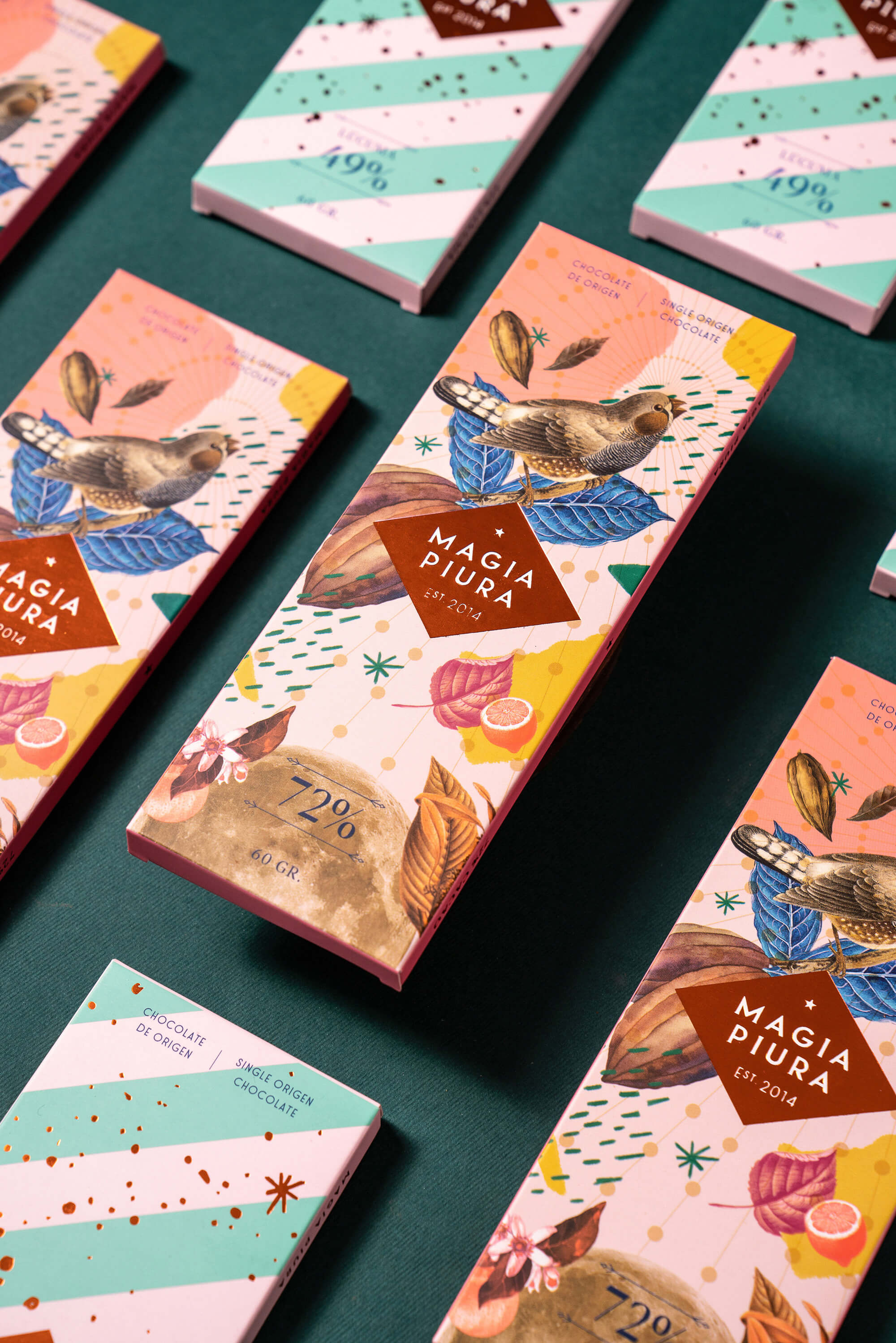
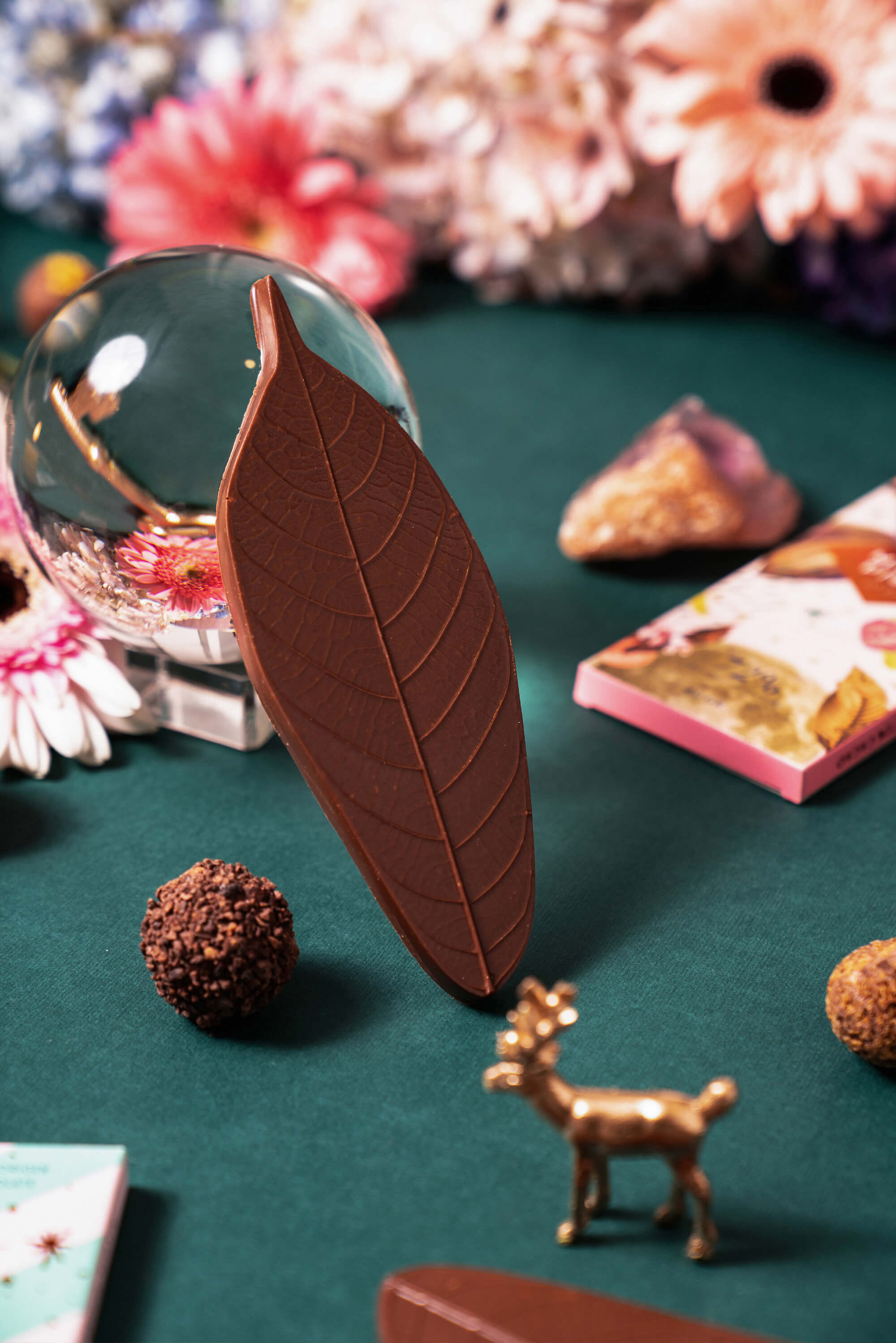
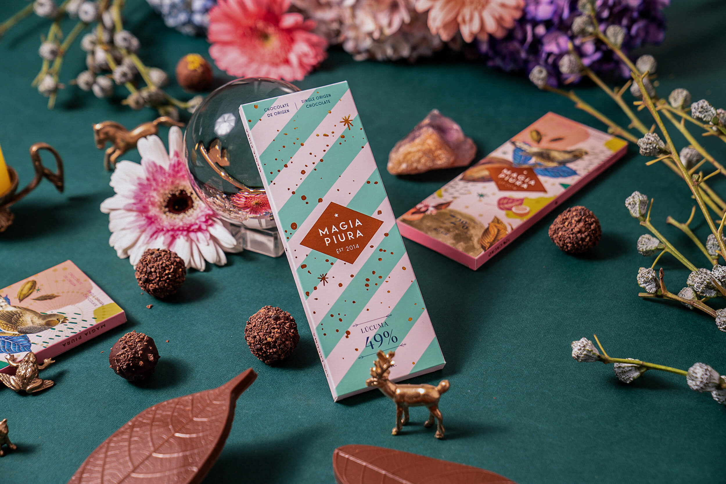
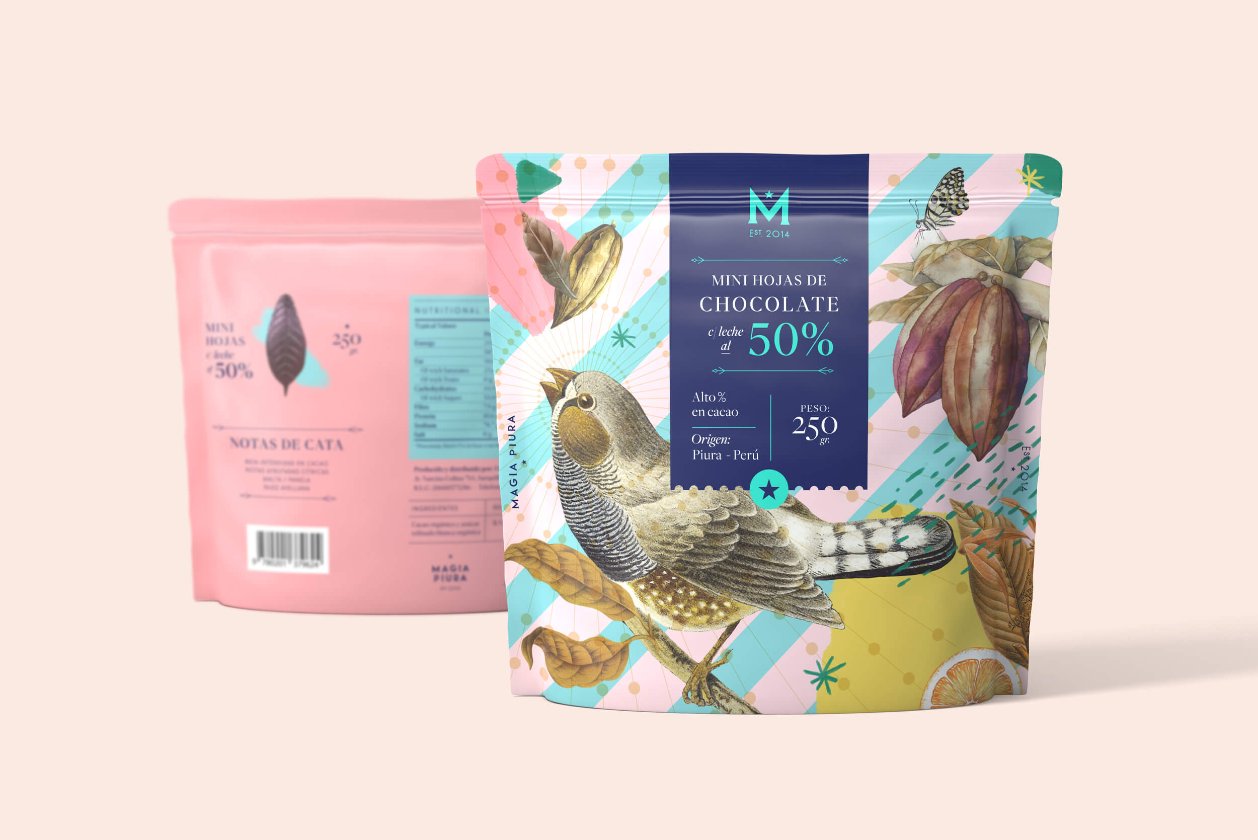
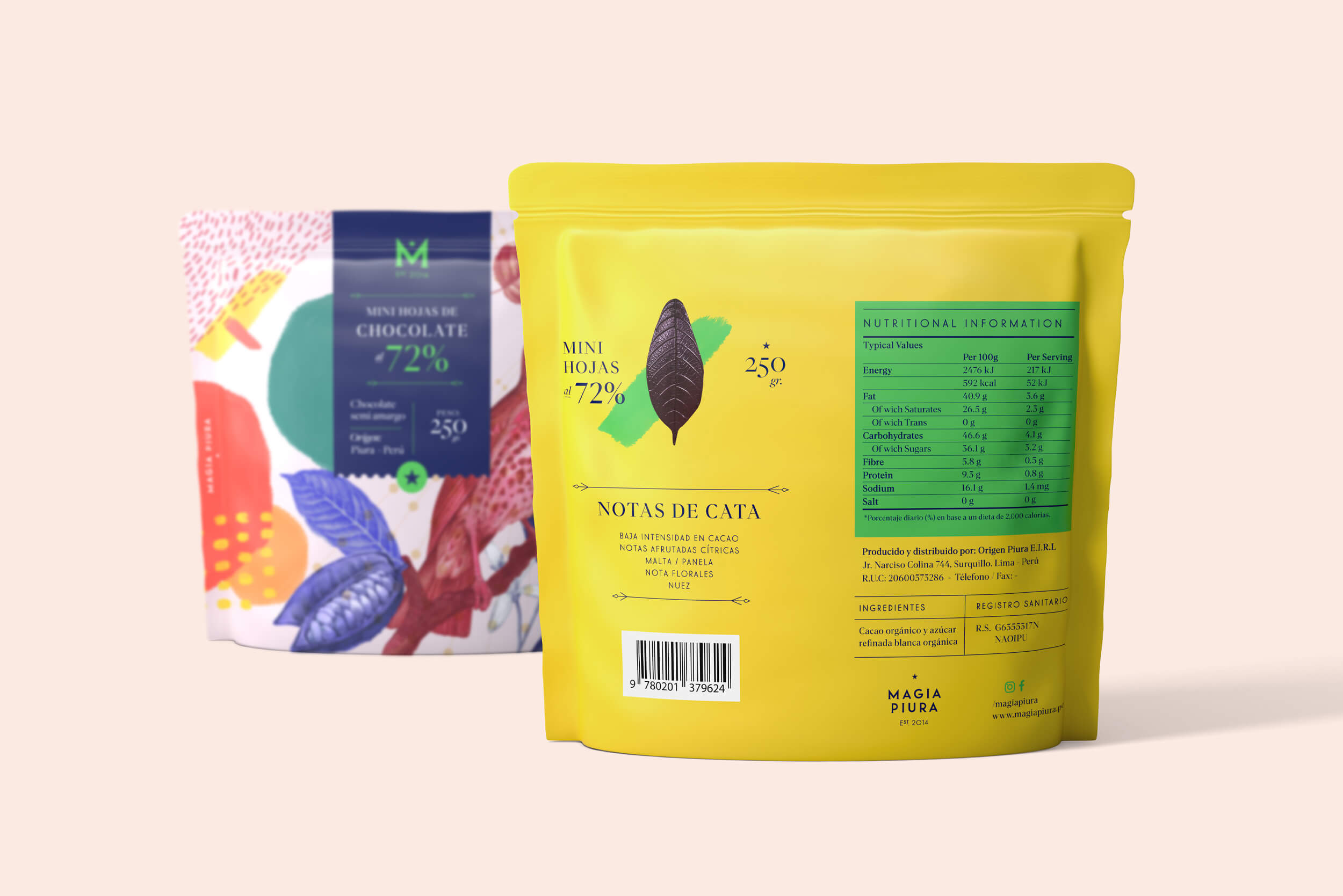
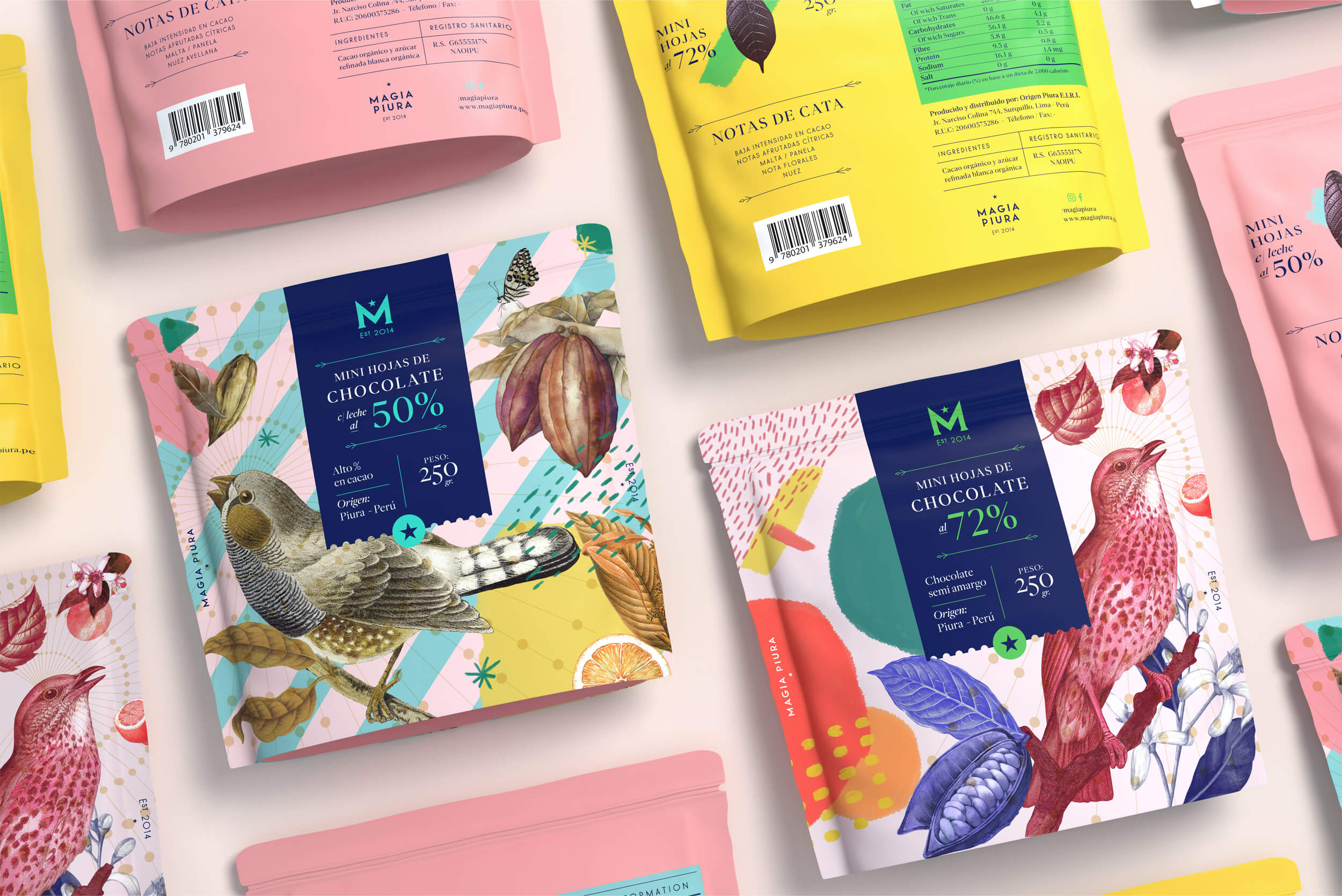
This time, the client asked to create a new packaging format, fit for a new product format. Magia Piura had already made its mark on the market with its characteristic leaf-shaped chocolate bar, this time, the challenge was to create packaging for these very same bars, but in their mini version. The key concepts behind this project were the same as what we had used in other graphic pieces for the brand: mysticism and place of origin, in this case referring to Piura, in the north of Peru, where the cacao originates from.
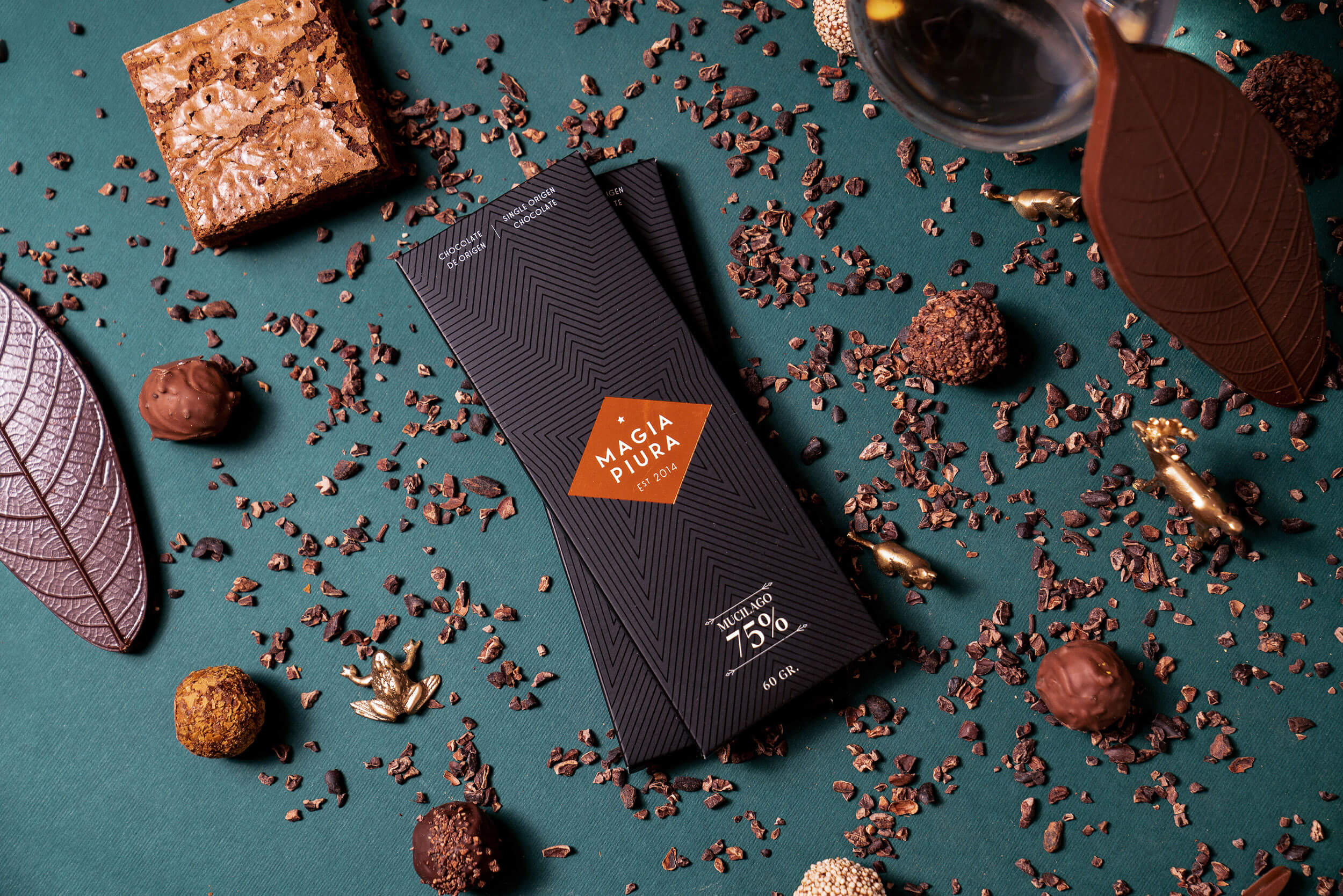
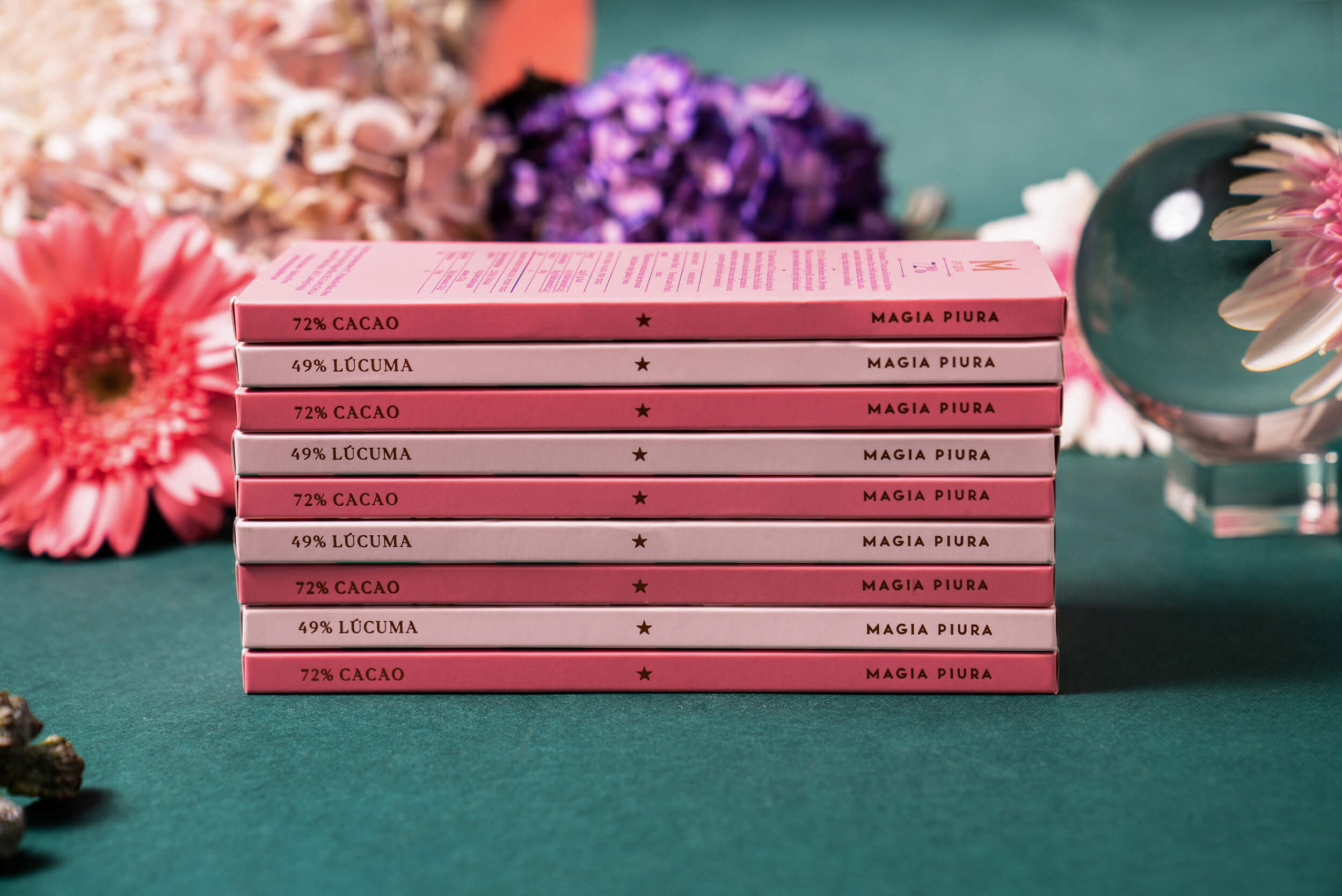
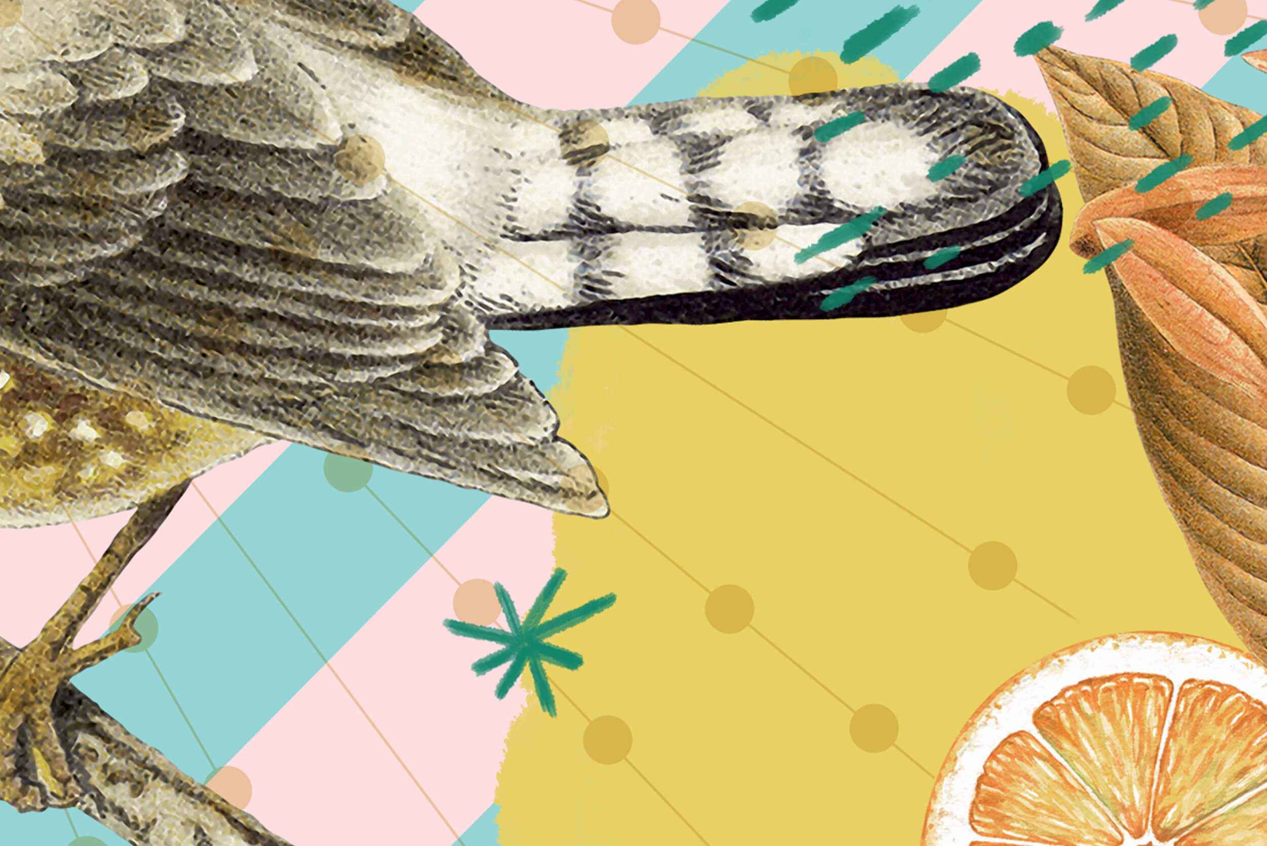
Geometric and asymmetric shapes, primary colours in tones that celebrate local biodiversity and graphic elements that reinforce the concept of mysticism are what give this packaging life. Pink and blue pastels have been used for the milk chocolate mini leaves, while the semi-bitter mini leaves use bolder colours.
Photos by Sumiko Miura, 3D rendering by Oscar Gómez Narváez
