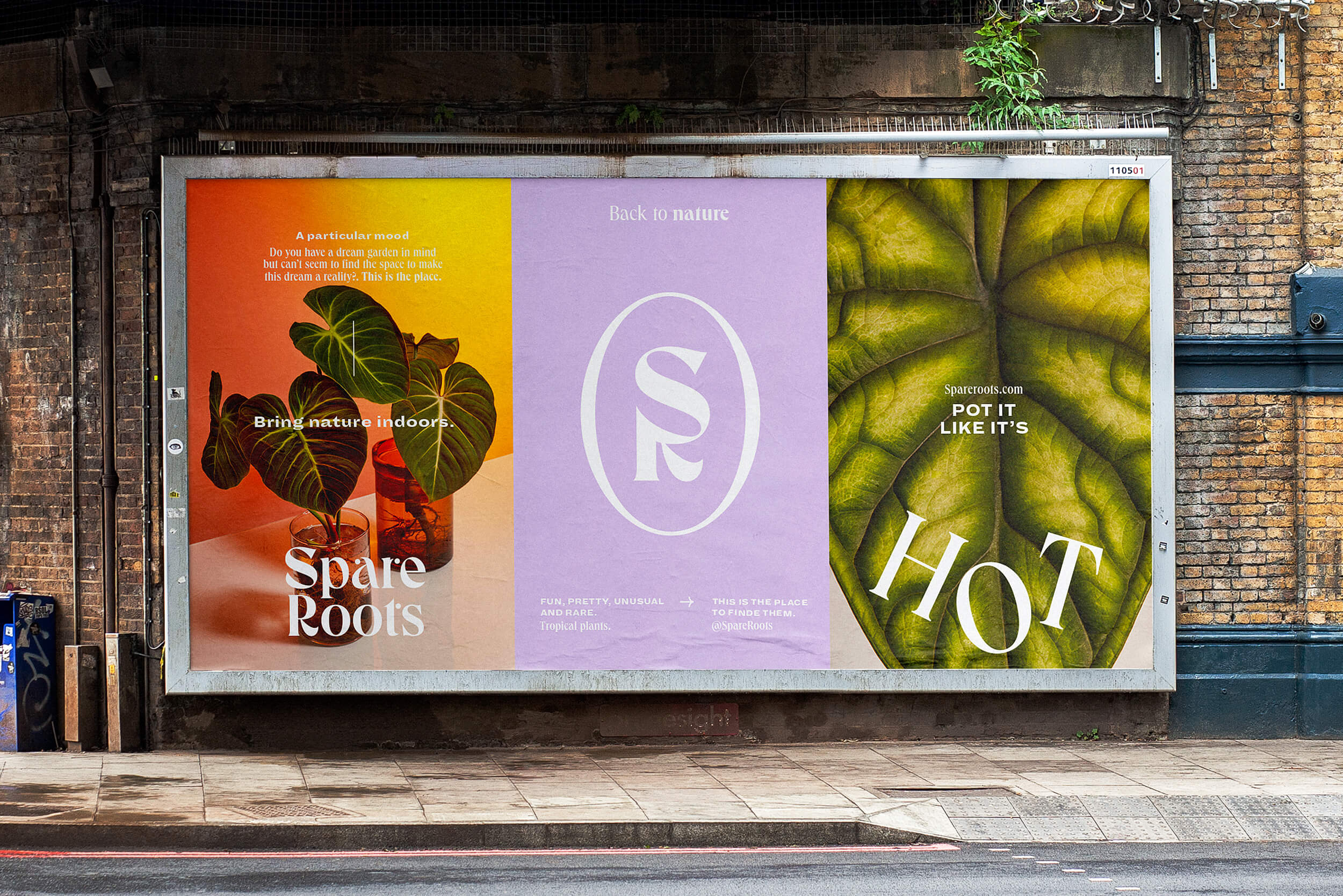
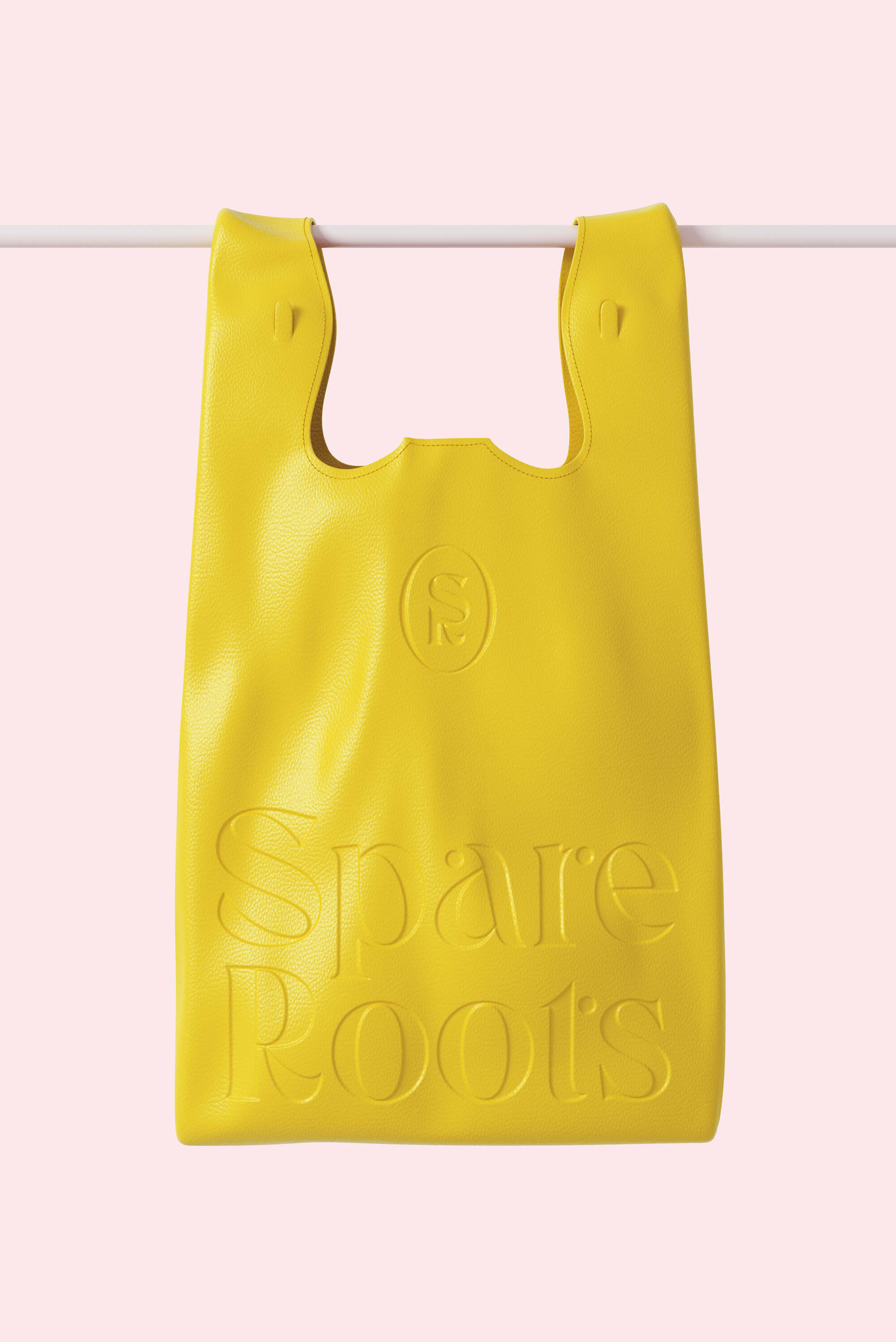
Spare Roots
Spare Roots is a plant shop that specializes in aroids plants, and we were commissioned to create a distinctive brand identity system for their launch. Drawing inspiration from the organic shapes and vibrant colors of the leaves, we aimed to craft a brand that would celebrate the diversity and individuality of each plant.
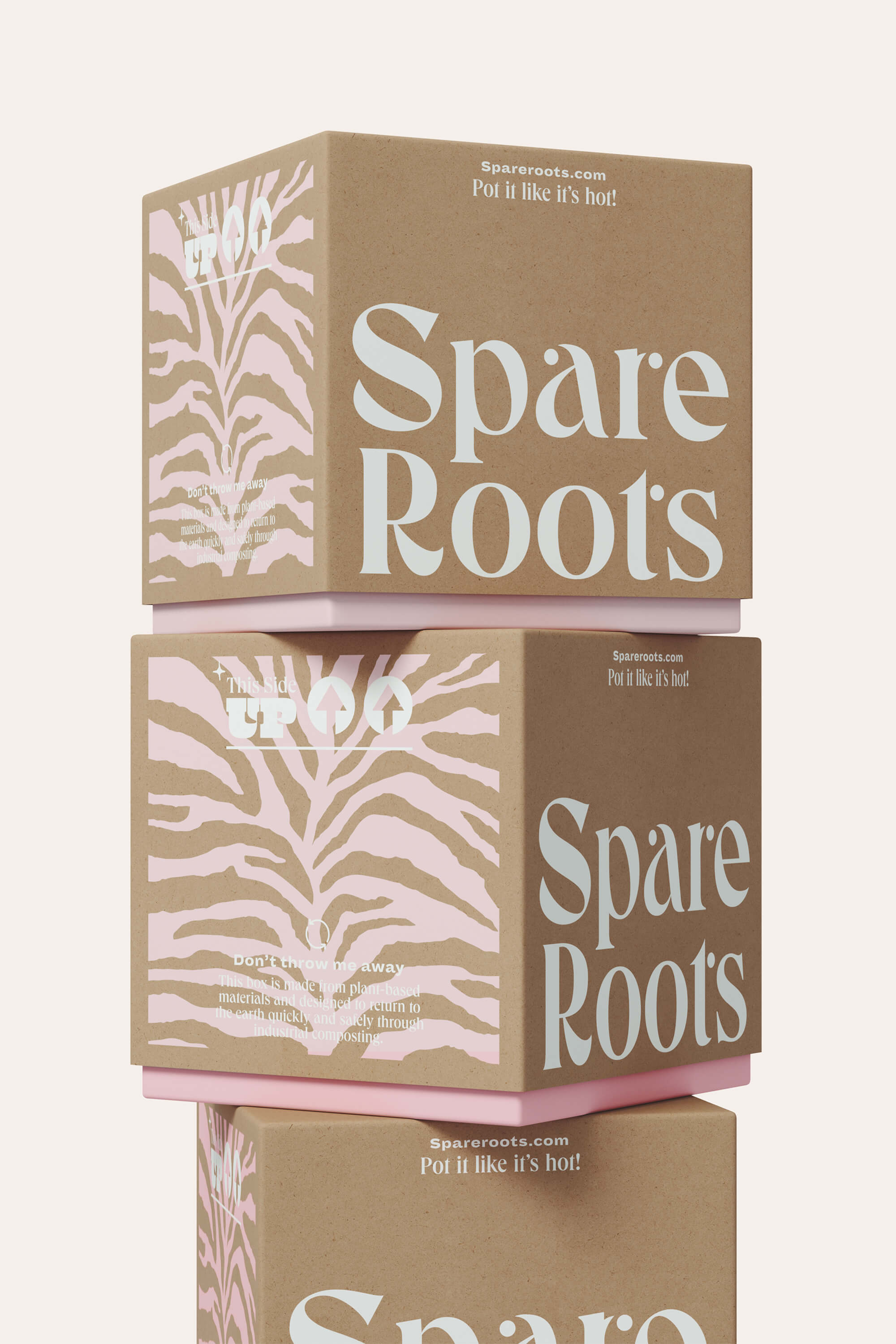
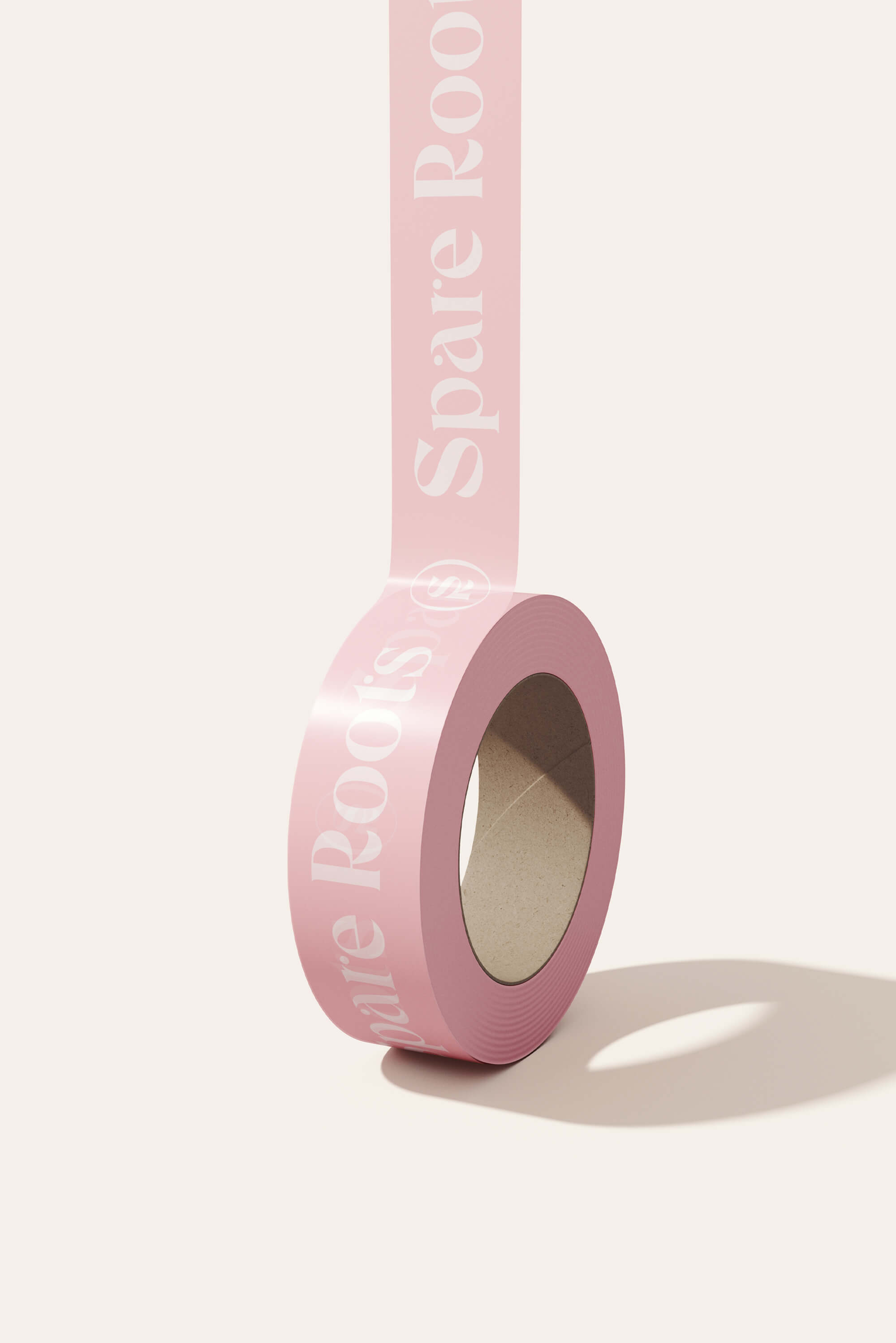
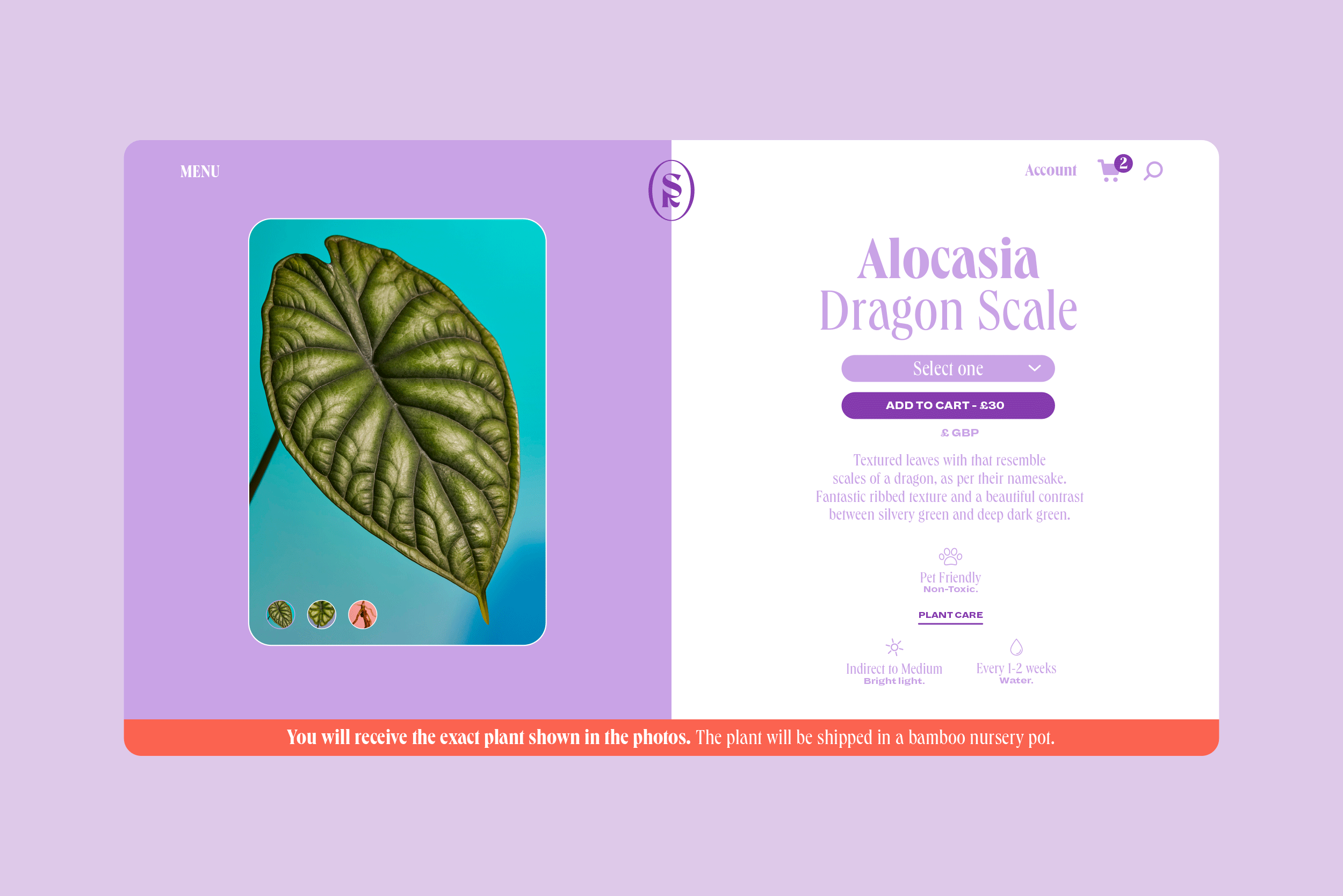
Our approach was to develop a brand identity and packaging system that would capture the playful and dynamic nature of plants, while still maintaining a professional and polished appearance. We aimed to ensure that the branding conveyed the unique character and beauty of aroids plants, setting it apart from other plant shops.
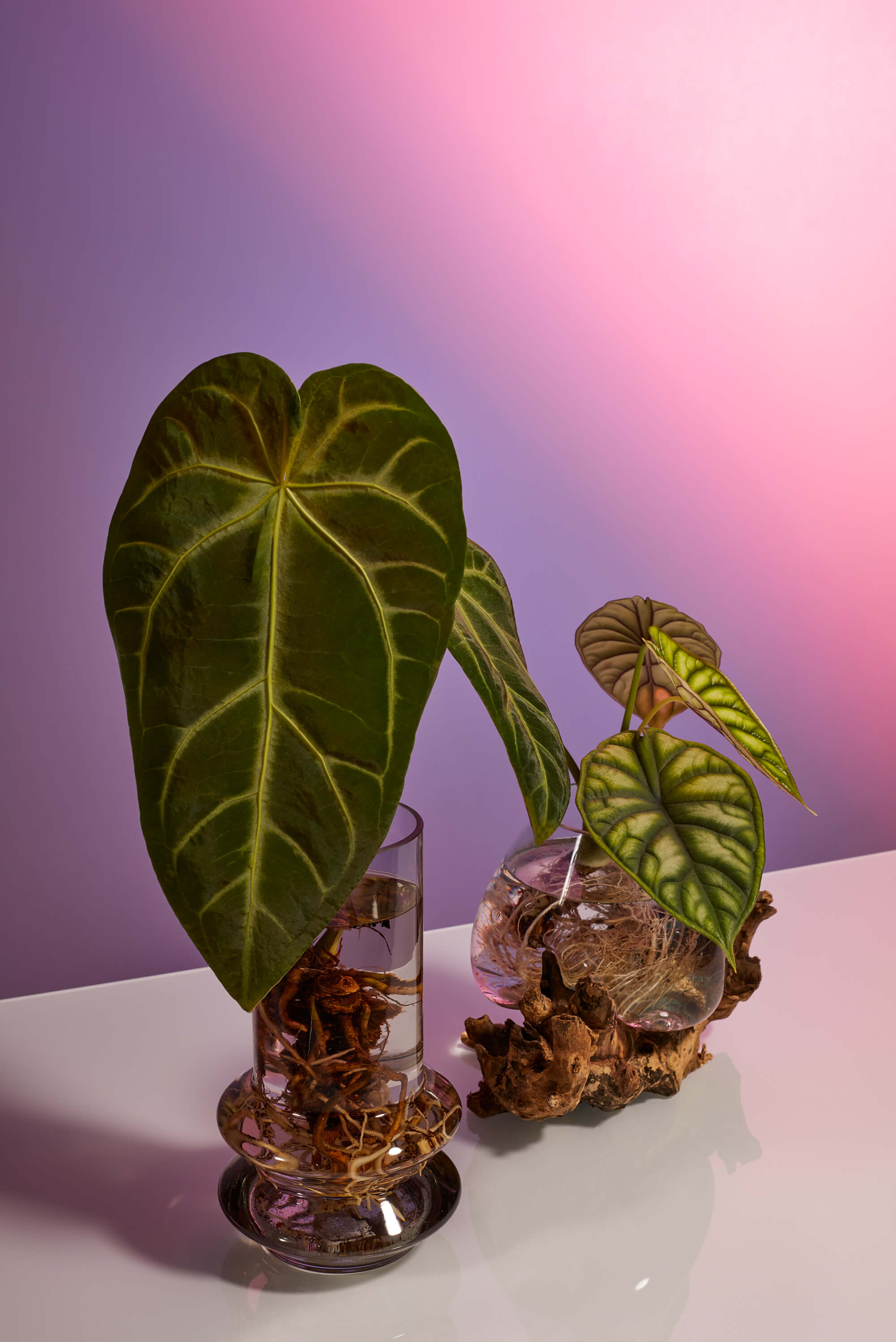
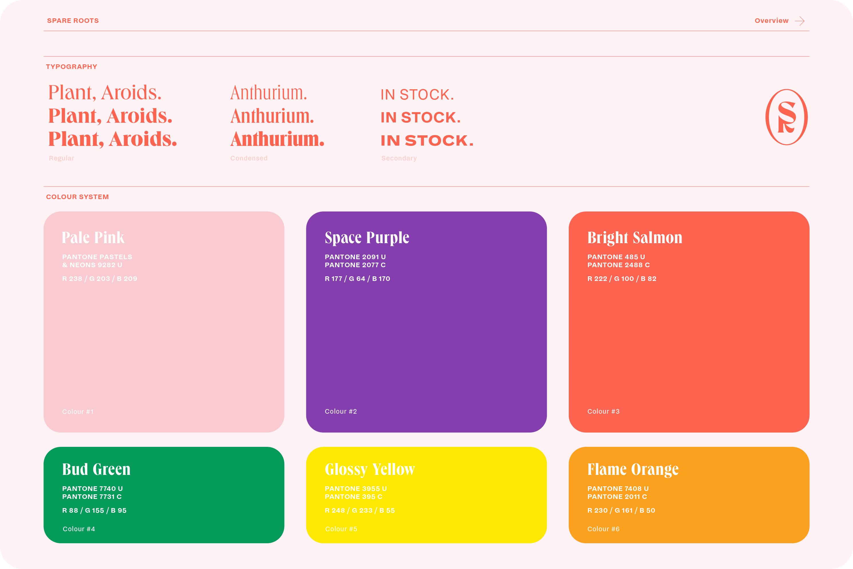
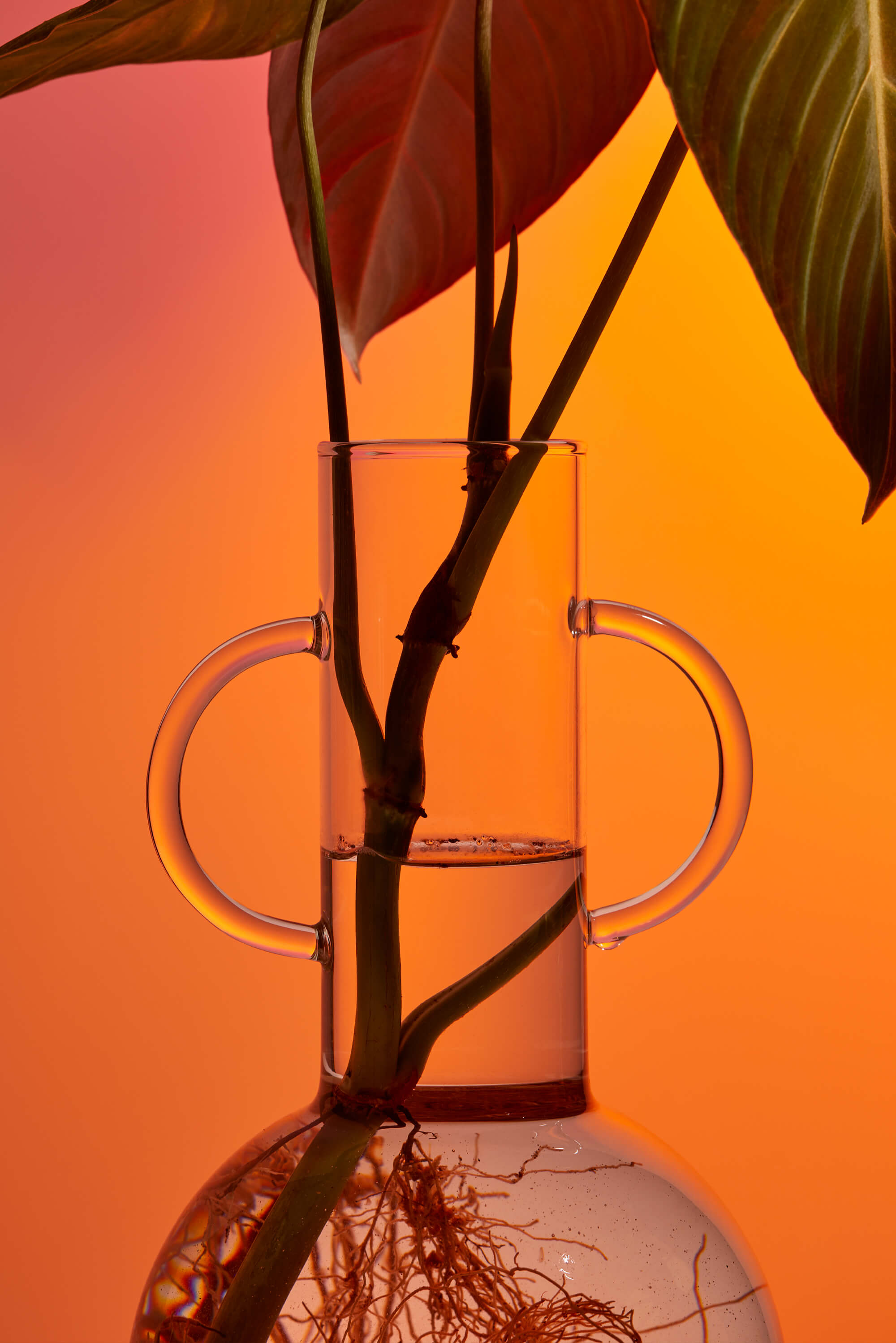
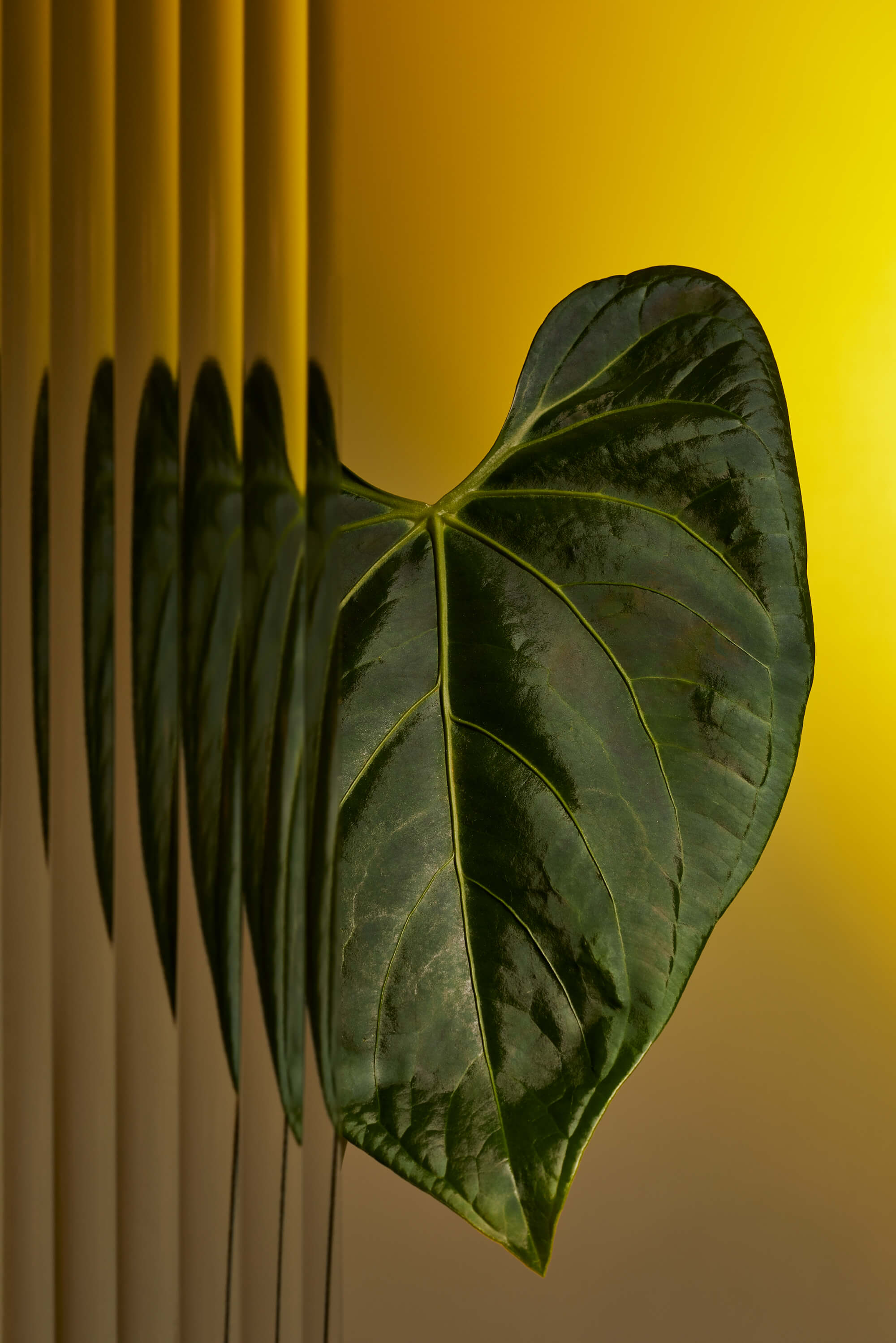
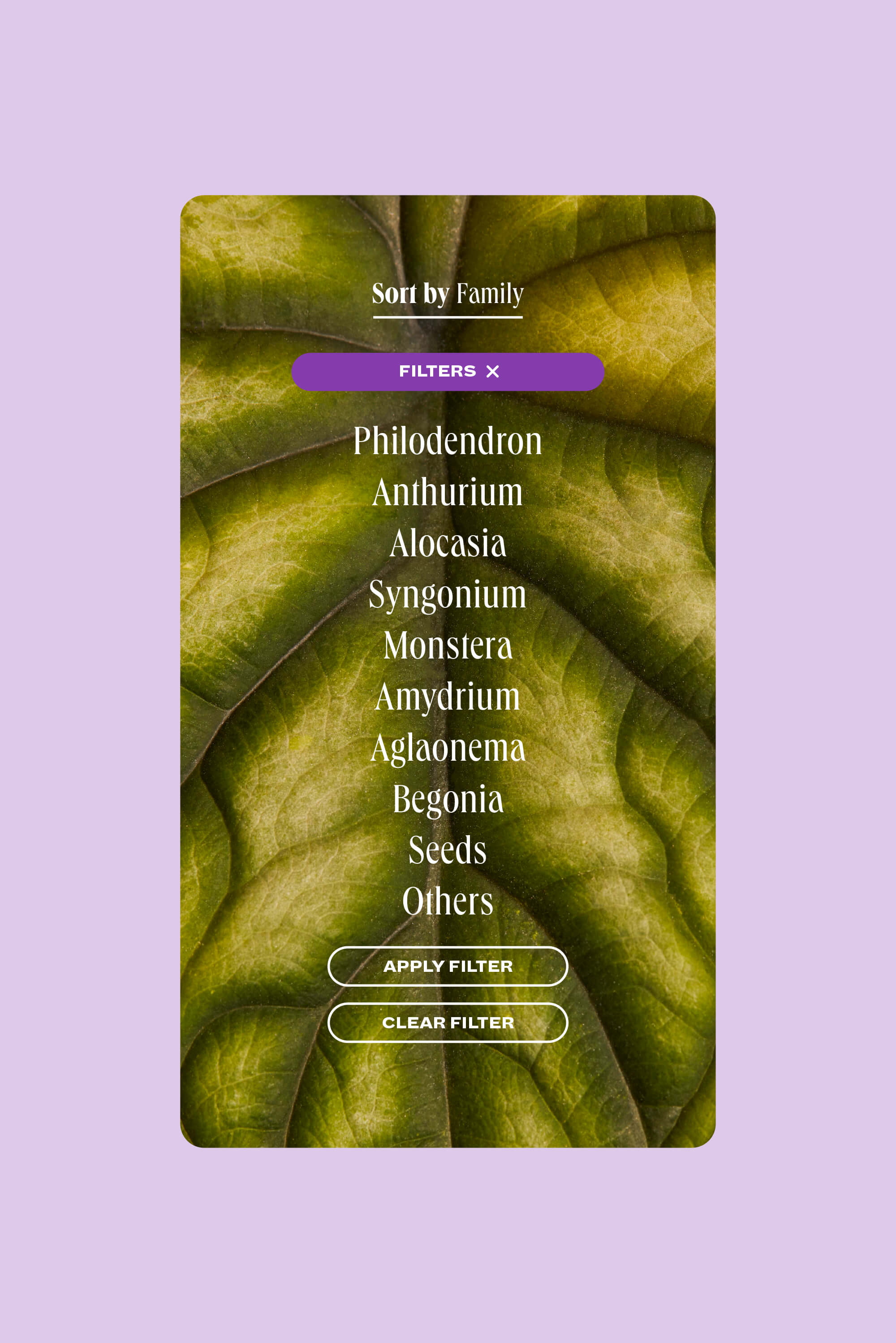
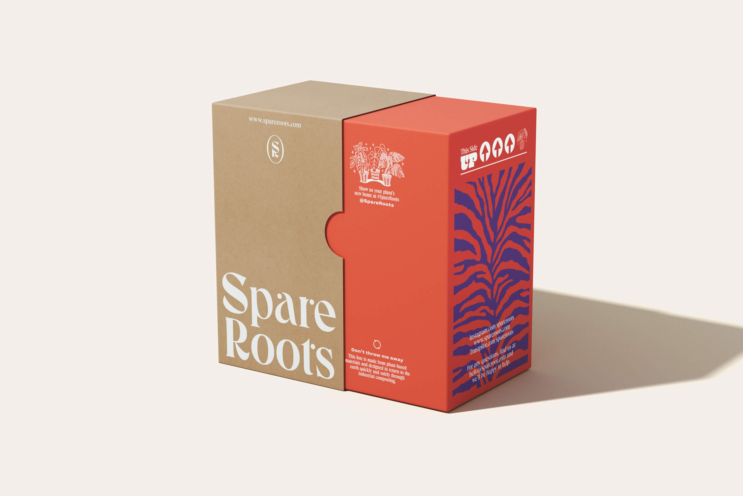
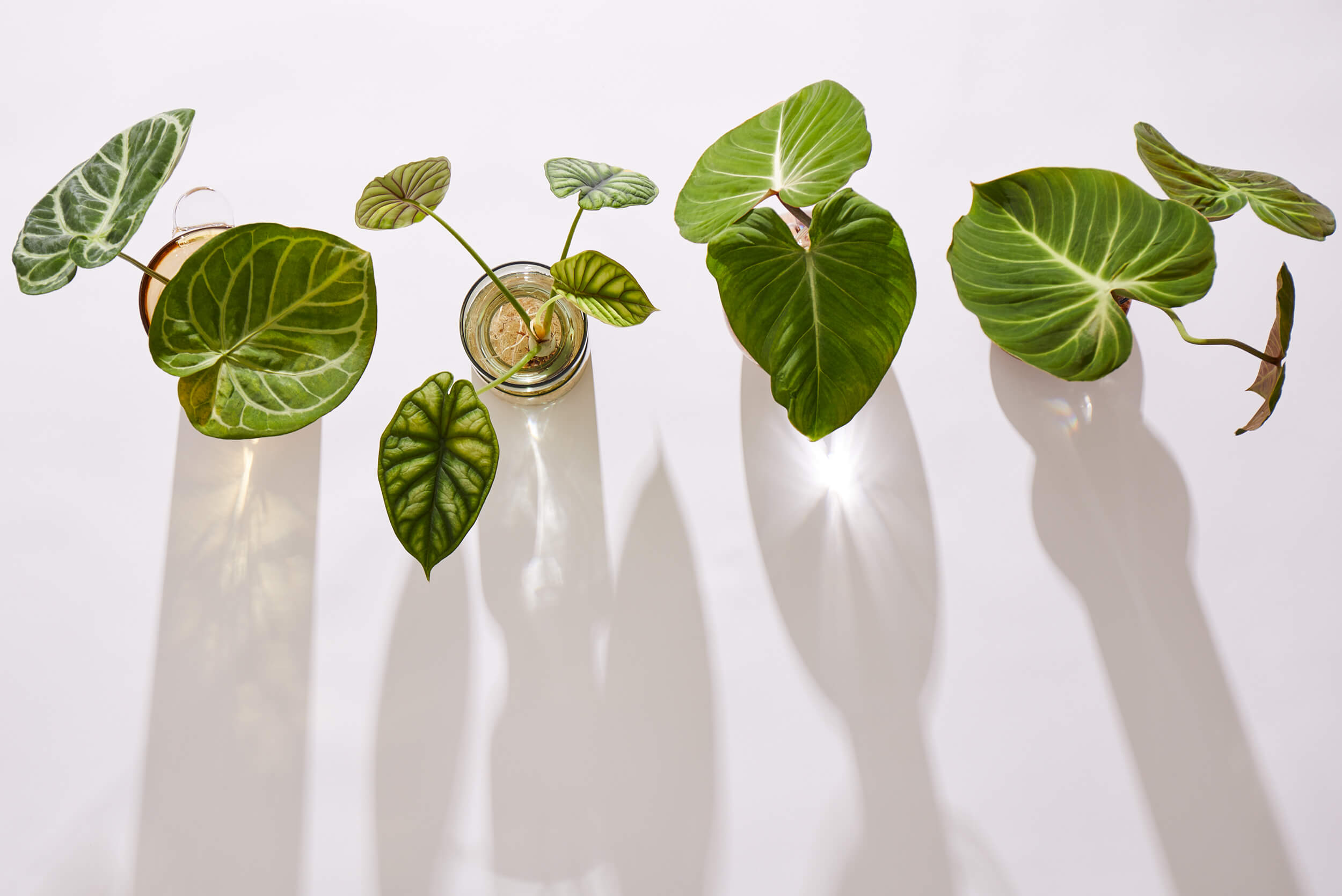
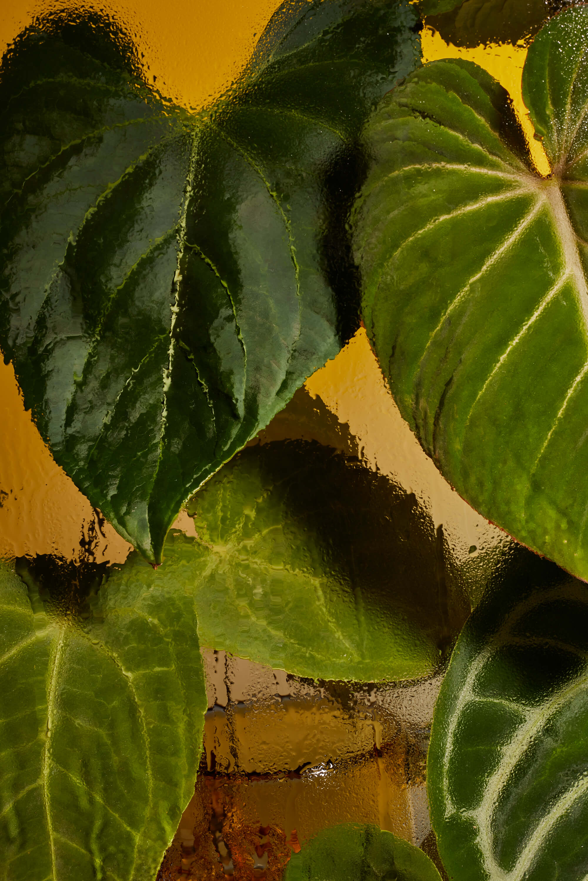
To accomplish this, we gathered inspiration from the name itself, as well as from the roots and veins of the plants, to create an organic graphic element that visually embodies these features. For the colour scheme, we decided to move away from the typical green color palette and explore a broader range of colors that reflect the vibrant hues of the leaves during the growth process, as many of them pass through shades of yellow, orange, or red before reaching their characteristic green color in maturity. For the photography, we opted to use glass vases to showcase the plants’ healthy roots, as this was a specific client requirement, given that roots reflect the true state of a plant. Additionally, we made sure to capture each side of the leaves from a closer perspective, enabling the plants’ innate elegance to construct a visually magical universe for the brand.
Photos by George House / Packaging Images by Óscar Gomez N.